Top Ones
View your top streaming artists whenever you want.
Part 1 - Design Breakdown
Project summary
Goal: Let music fans see their current top 50 artists on Spotify whenever they want, letting users connect more meaningfully with their favorite music.
Solution: Mobile app that connects to Spotify and shows your top 40 artists right now.
Status: Shipped - sign up here!
My role: Everything (product design, user research, product strategy)
Shipped it
Shipped it
Try Top Ones for real.
Once just a design concept, Top Ones is now a real app, built using Bolt.
Due to Spotify API limitations, users can only sign up when they’re pre-registered– drop your Spotify email address below and I’ll send you an invite (must be your Spotify account email).
I tried to build the app as close as possible to the original designs. Those original designs are below.
View your top streaming artists when you want
If you spend a lot of time streaming music like me, you probably look forward to seeing your top artists at the end of the year. But wait… they only show you up to #5??
Top Ones frees you from Big Music knowing all of your listening habits, but not being able to spare even your Top 10 😰.
Connects to Spotify
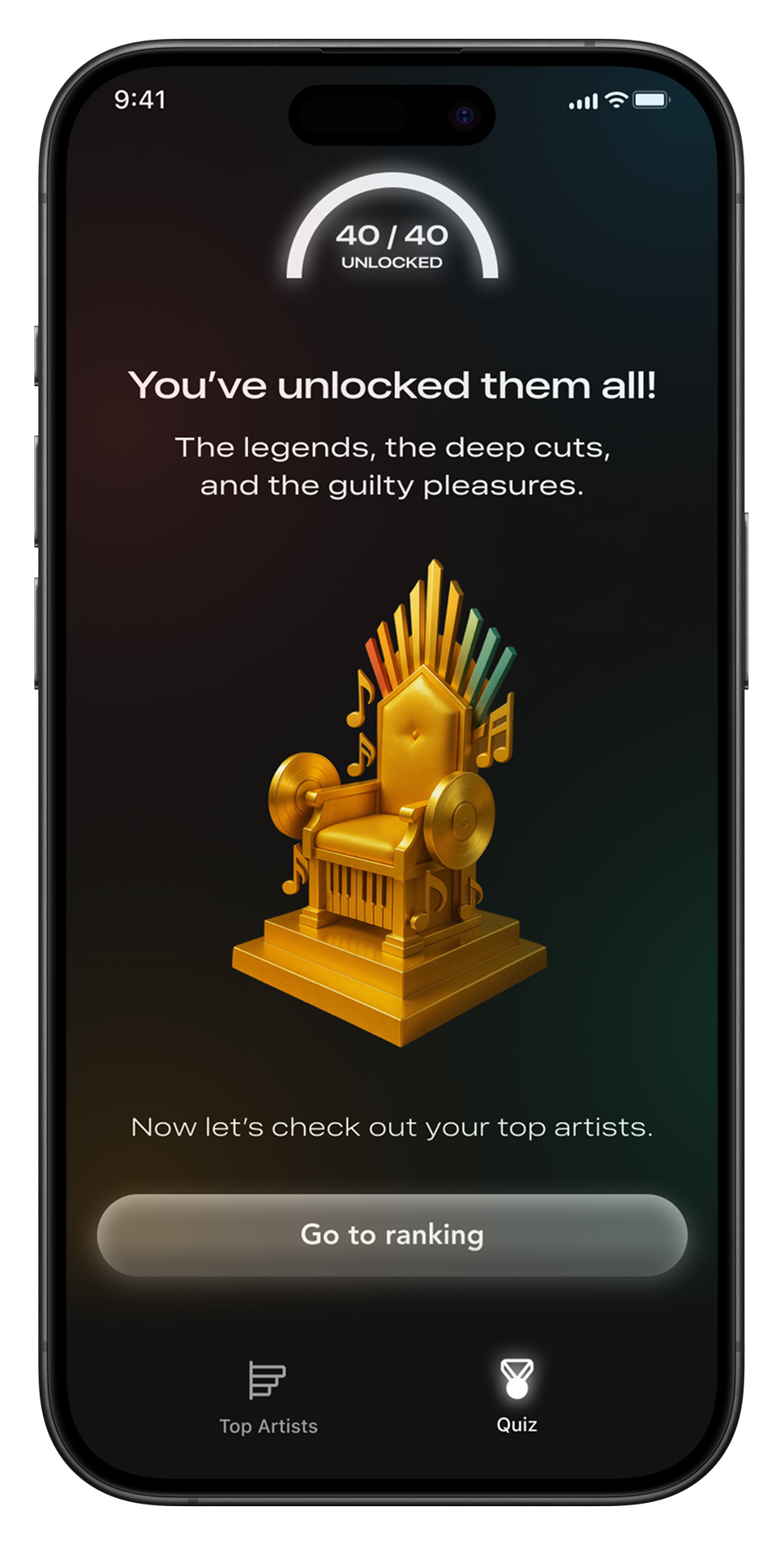
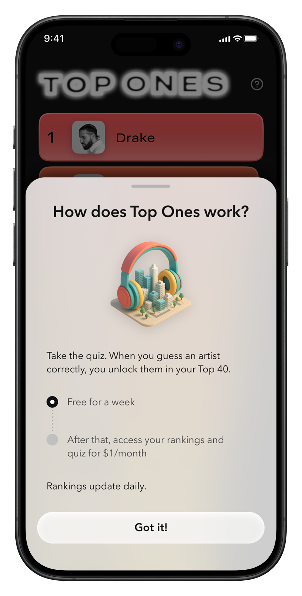
Connect your Spotify account to see your Top 5. Then, take the quiz to see how well you know your own top artists. Unlock your Top 25 by getting all of them right.
More than top artists
Music is worldwide. Top Ones lets you go beyond your personal top artists ranking by quizzing you on how artists you listen to stack up on global streaming charts.
And it helps you notice trends in your own music listening by quizzing you on genres you’ve listened to most recently.
Simplifying the value proposition
At first, I imagined Top Ones as a data visualization tool, a way to explore your Spotify data more deeply. The initial wireframes reflect this. Under this initial vision, users would have been able to see various charts and visualizations and flip between different filters. I’m a bit of a stats and data nerd, so this appealed to me.
But then I realized that most people may not want or care about this level of detail. Even if someone wants to see their top artists, they may not want it to feel like analyzing data.
I thought about how to make the value proposition more straightforward. Because, surprisingly, there isn’t an easy way to see your own top artists on-demand, that functionality could get people excited on its own.
Design inspiration
An inspiration for Top Ones’ visual design and interaction design was Pyro, a DJing app developed by the music software company Serato. The app let you easily make DJ mixes with songs in your library. It was launched in 2016 and has since been discontinued. I think I heard about it around then and downloaded it, but didn’t end up using it much. The design must have stuck with me. I appreciate its creative and functional use of color, and “microinteractions” that appear in response to core actions.
Pyro’s design draws heavily from 2010s-era flat design. The visual design is extremely minimal, in a way that feels a bit dated and lacking polish. But it is pretty easy to pick up and use, thanks to the simple interaction design. Notice how Pyro went outside-the-box in adding small visual flourishes, called microinteractions, to some of the core gestures and visual components. For example:
pressing ‘Next’ triggers a little flame
swiping down/up on the song queue causes the menu to appear/hide
swiping left or right on a song causes it to tilt upwards, and an icon appears to indicate what is happening
Microinteractions are now a common pattern in consumer products, including Spotify; I don’t remember how widespread they were in 2016. This is clearly an app targeted for a tech-savvy DJ crowd, and I could see how other types of users might prefer fewer visual bells and whistles. But hopefully the app’s functionality is simple enough, and these microinteractions are unobtrusive enough, that usability is not impacted.
I like products whose design both follows the rules enough to maintain good UX/UI, but still takes opportunities to color outside the lines. These two goals are often at odds, but when a product gets it right, it can be memorable. One of my goals for Top Ones was to strike this balance.
“Tap here” animation
One piece of feedback I got on an early iteration of Top Ones was that it wasn’t clear enough that users could tap on artist rows to expand them. To address this usability concern, I designed a microinteraction to be displayed on the top row if a user does not take any action after landing on the page. The goal is to give some guidance to users who need it, while not distracting from the user experience for anyone.
Designed to be shared
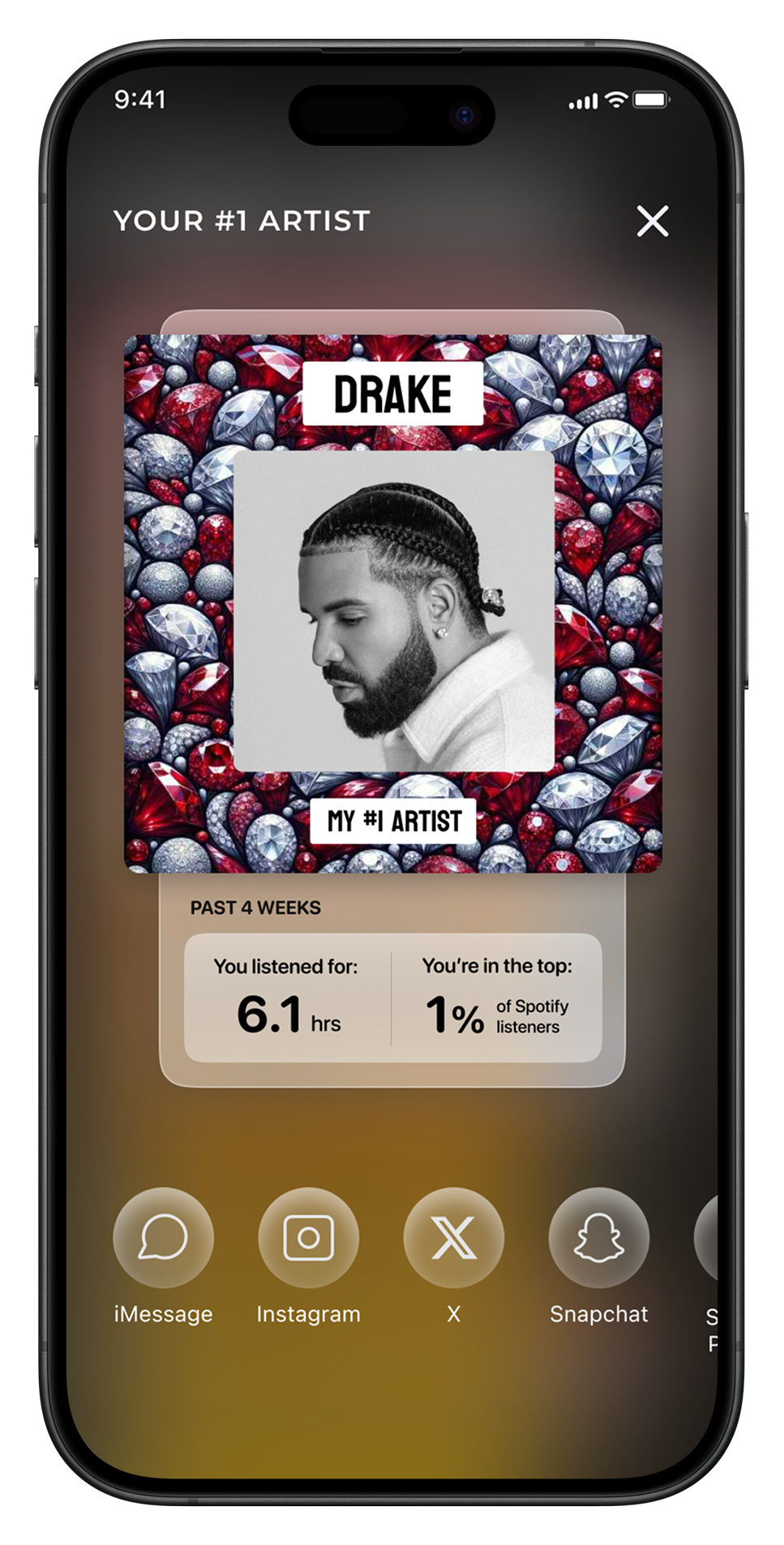
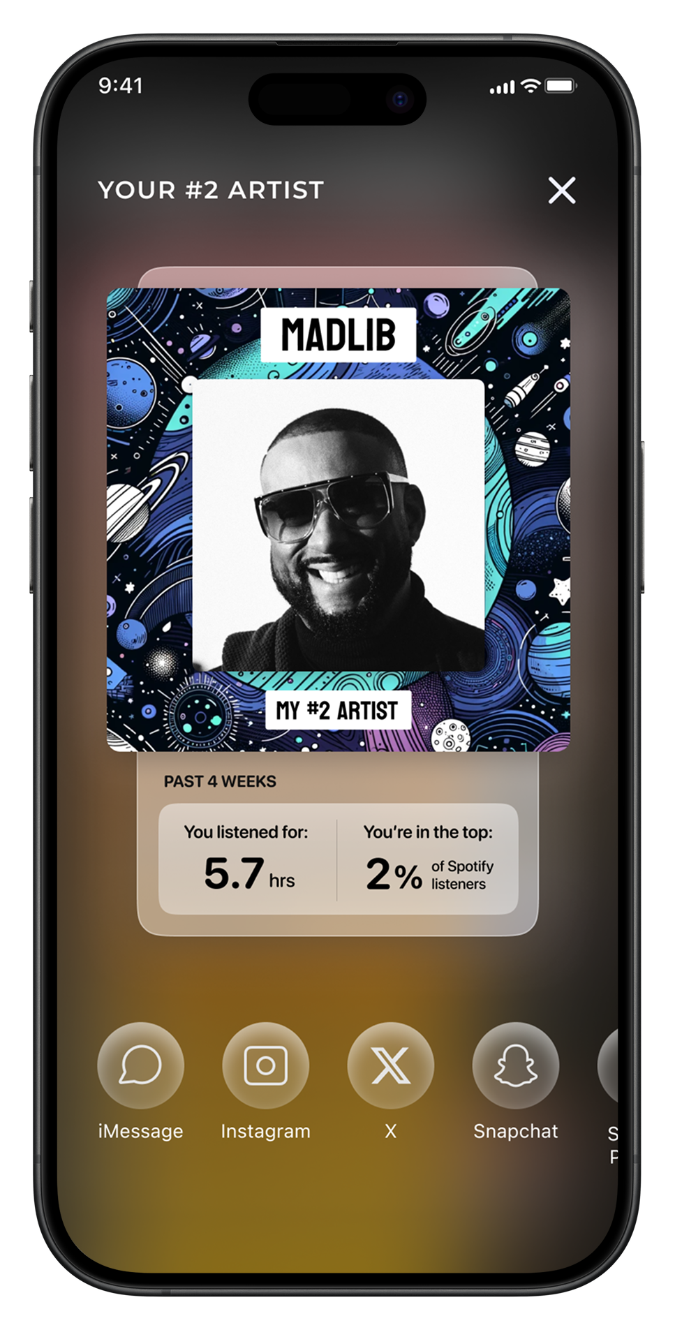
Music is meant to be shared - so is Top Ones. When you’re asking people to share your product, you should give them something that looks good enough to share.
With this in mind, I designed a “share” image to encourage users to share Top Ones with their friends. I created background graphics using DALL-E and DreamStudio.
This was inspired by Spotify and Genius, two music apps with thoughtfully-designed ways for users to share content.

